Showing posts with label Individual. Show all posts

Tuesday, 12 January 2016

Rough Edit

Rough Edit

We have made a rough edit of our film. It still needs some work, but it is a good idea of what it might look like. We still need to add sound effects, change the music slightly and come up with a look for the title. For now, however, here is our edit:


Saturday, 2 January 2016

Sound

Sound

We have decided to add most of our sound in post, as there is very little, if any, actual sound in our scene. Also, carrying around an audio recorder will be difficult and unnecessary, plus it would just be another thing to think about.


     Music

We will be using royalty free music composed by Ben Worley and Triune Scores. The tracks have been broken down into their component parts and so are very customisable. There is an excellent selection of dark and tense music which will work very well.
The Music

Sunday, 27 December 2015

Preliminary Edit

Preliminary Edit

After the shoot, Sam went home and did a quick preliminary edit of the first half of the opening (up to the fight scene) to check that we had all of the shots we needed for our piece. This was really useful (and immensely exciting) as it meant that we got to see a VERY rough draft of how our opening might look when finished. Below is a video of the preliminary edit, plus a conversation where we discuss the edit, our plans for the final edit and some reactions we have had to our prelim.


Thursday, 24 December 2015

The Shoot

The Shoot

We shot our film on the 22nd of December, from about 3 until 7. It was a very interesting, fun, and informative evening, and by the end we had all the shots needed for our opening. Our shoot went fairly smoothly, although we did face a few problems as we went along.

     Setting up

Crystal, Sam and I arrived at 3 o'clock, an hour before our actor was due to arrive and we were scheduled to start shooting. During this time, Sam set up the camera and lighting, Crystal got changed and prepared for her role, I created the symbol and all of us created the mess necessary for our opening.

     Shooting

Our actor, Oliver, arrived at 4, and we started shooting at around 4.30, half an hour behind schedule. We started shooting late because we took more time setting up than we expected, due to the fact that we had to unpack and prepare various things, then brief our actor on what to do. After a few practice runs and planning of the first shot, we were ready to start. We shot our first take of the first shot at about 5.

Around 40 minutes later, we had finished filming the continuous shot. We had a quick break to gain some energy and relax a bit. We then carried on filming, moving on to the fight scene between Crystal and Oliver. We carried on until about 7, when we finished filming our final shot of the day. We tidied up the flat and packed all the equipment away, and about 30 minutes later, we were out of the flat and gone.

     The continuous shot

We decided to film the first shot, the long continuous shot, first, partly because it made sense chronologically, and partly because it was getting colder and darker as we filmed. We had scheduled 2 hours to film this shot, as we thought coordinating it would be really difficult, and it seemed like a hard shot to execute well. However, the first shot actually only took us about an hour total. This is because coordinating it was actually relatively simple, and with good communication we successfully planned out the timings and orders. When filming this part, Crystal and Sam would stand inside the flat, and I stood outside with Oliver. Me and Crystal would call each other and count down from 3, after which I would signal Oliver to start walking whilst she told Sam to start filming. As a result of this good communication and teamwork, the shot only actually took 4 takes before we got a perfect take, which was really surprising. We moved on from the shot much faster than we had anticipated, meaning that we were well ahead of schedule.

     The fighting scene

The fighting scene balanced out our timing success in the first shot, as it took much longer than we expected. Our plans for this scene were much less specific than the ones for the continuous shot, plus we still had to choreograph the attack. This was one of the reasons why the scene took so long to film. As well as that, we also took much more takes, as we wanted to get the action from several different angles. This means that we filmed the fight and death many times, improving the choreography and building on the action as we went along. Eventually, however, we were finished, and started packing to go. We left at about 7.30, half an hour before we were officially due to finish.


     Problems

We faced a few problems when filming. The main problem we faced was that the fake knives kept on breaking, as they were quite cheap and not especially well made. However, we fixed them up with some tape and used them as much as we could. We also had a minor problem with the first scene in that the door to access the flat would lock automatically when closed. To get over this problem, I stood by the door out of sight, keeping it slightly open so that Oliver could get through and up the stairs. We also had the issue that the lights and mirror in the bathroom could potentially reveal Sam with the camera. To overcome this, we planned out the shot carefully, ensuring that he could not be seen in the light.

     Changes

We made a few changes when filming compared to our plan, and most of these were to do with props. Firstly, I decided that a poker would be inconvenient for travelling and difficult for Oliver to pick up quickly.Therefore I decided to bring a walking stick instead, as it was lighter and more convenient to carry, whilst still being quite threatening as a make-shift weapon. We also decided to ditch the top secret file, as there would be no use for the papers to be messy if they were all in a pile. Also, the assassin would have taken the top secret file with her if her aim was to gather information, which it was. Therefore, we left the file. We also decided not to use the fake blood, as it would make re-takes of the fight scene really difficult and be harder to work with continuity.


     Overall

Overall, I think that our shoot was quite successful. We got all of the shots that we needed, plus had extra time to film more shots, such as a B-roll of paper. We worked very well as a group, and Oliver was a fantastic actor for the scene. If we were to film again, I would have got permission to mess up the room more, pulling objects out of place and on to the floor rather than just scattering a few papers. I also wish that we had tried getting different reactions/facial expressions from Oliver so that we could play around with shot sequencing and meaning making in editing. However, I think that what we have is good, and that there will hopefully be no need to film any of it again.

Wednesday, 16 December 2015

Research into Symbols

Research into Symbols

As part of our film, we need a symbol to be left by the assassin that links to the organisation he is fighting. I decided to research into symbols in order to create one that we can use in our film.

     Potential Symbols


     Some Ideas

Here are some early designs for our symbol. Most of these are based around the Jupiter symbol, as it has many relevant meanings, plus it looks quite good.


     The Symbol

We chose some of these symbols and added them together to create our symbol, which we have called Arc Diath.


The symbol is a combination of Aries, a circle, and a diagonal thick line. The symbol represents ambition, determination, potential, beginning, strength, tension, and uncontrolled energy. These traits very much represent our evil organisation, and shows what they stand for and their aims. The name was a combination of all the names of the symbols, and we have decided that it will be the name of the evil organisation.

Sunday, 13 December 2015

Props

Props

     What We Need
  • Fake knife - for assassin to stab spy
  • Fake blood - for the stabbed spy
  • Poker - for the spy to grab when they feel threatened
  • Top secret file - for the spy to rifle through
  • Papers - for the spy to rifle through, and to create mess in the flat

     Where We Will Get Them

Samuel is going to get two fake knives for us to use in the film. They work by the blade retracting when it is pressed against an object. They look quite fake close-up, but they will pass for actual knives if seen from a distance in the dark for a quick flash of time.


Crystal already has some fake blood in her house, so we will use that for our film. She has tested it out to see how it looks, and it passes for blood pretty well, especially in the dark.


I have a fire poker at home that looks fairly dangerous but is actually pretty non-lethal. The only issue is that there is no fireplace in the flat - however, it could be in a room we don't see, or the spy could keep it in his house for protection.


Crystal has some plain brown paper envelopes in her house. We can write a 'TOP SECRET' sign on top of it in red pen, to make it look like an important package of papers.


My family keeps scrap paper in our house, so we can scatter them around the flat and put them on the table for the spy to look through. Several of the papers we own look very professional, important, and serious, so as long as no-one reads them, they will be perfect for the scene.

Wednesday, 9 December 2015

Shot Sequencing

Shot Sequencing

The order that shots are placed in has a huge effect on meaning-making for that moment. Below is a storyboard for the first minute or so of our film. It shows 4 consecutive-ish frames from our continuous shot from the opening. I have explained the meaning of the frames, and how the order effects the meaning of them.


Monday, 7 December 2015

Storyboards

Storyboard

For our film, we created a storyboard. This allowed us to visually see what the film will look like. It also made us consider which shots to use, why we should/shouldn't use them, and what meaning making we can make with the shots. This storyboard gives us a plan to work with, although there will likely be some improvising on the day. Below are our storyboards with descriptions of what the scene will look like. Note that pages 1 - 3 all cover the same continuous shot.


Friday, 4 December 2015

Todorov's Theory in Our Film

Todorov's Theory in Our Film

We have decided to follow the theory in our film. So far, we have decided that the plot of our film will be like this:

1. A group of spies are living their normal spy lives
2. A spy is killed in his home and a strange symbol left by a mysterious evil organisation
3. The main character is sent to go and investigate
4. The character attempts to take down the organisation
5. The character takes down the organisation, and life returns to the spy version of normal

Our opening will show the first spy being killed in his home, and the strange symbol being left.

Thursday, 3 December 2015

Dos and Don'ts for a Successful Final Piece

Dos and Don'ts for a Successful Final Piece


I looked at some examples of final pieces from previous years in order to create a list of tips/rules for creating a good final piece. I looked at these 3 samples:
Here are the things I discovered.

     Do:

  • Use suitable music that relates to the genre (e.g. tense, crawling music in example 1 to create suspense)
  • Create suitable colour schemes, both in filming and editing (e.g. the dark tones and colours in both examples 1 and 2)
  • Use a suitable and interesting variety of camera shots and angles (e.g. the depth of field shot with the vodka at 0:30 in example 2) to show off skills and create an enjoyable opening
  • Use suitable fonts and colours for titles (both example 1 and 2 use simple clean, white fonts in accordance with their thriller-type genre openings)
  • Obey all of the filming rules, such as 180 degree line and match on action, so that the viewer is totally immersed in the opening and is not jolted out

     Do not:

All of these points can be seen in example 3 at some point.
  • Have moments of silence without there being a valid reason - for example, a short moment of silence could be used for suspense - but if there is no reason it should not be used
  • Break the fourth wall at any time (e.g. 0:45)
  • Use unsuitable titles with unsuitable animations (0:0 to 0:13), or ending it with rolling credits like the ending of a film - it's an opening, not a short film
  • Have a confusing plot with bad continuity (e.g. the disappearing snow and muddling story line)
  • Break the 180 degree rule (when the man is standing there and calling)

Tuesday, 1 December 2015

Our Idea

Our Idea

Our idea is to show a spy returning to his house to find that it has been searched, and his objects strewn around the room. He picks up a poker and rushes to a file on his table, where he desperately searches for something. He sees a mysterious symbol on a piece off paper, and as he bends down to pick it up, a dangerous assassin is revealed behind him. After a brief struggle, the assassin kills the spy, and leaves a strange symbol on the dead spy. The symbol then burns into the credits, showing the title at the same time.

Here is a record of some of the things we discussed when planning our film idea:


Below is a mood-board made by Samuel to show the atmosphere and feel of our film. It creates an idea of the suspense and mystery that we wish to create, and suggests elements of action whilst not being completely full of car chases and fight scenes.


In terms of an age rating, we have decided that it would probably be a 12. This is because although it contains some violence and suspense that would not be suitable for young children, there is not a huge amount of intense blood, gore or suspense.

Monday, 30 November 2015

Todorov's Narrative Theory

Todorov's Narrative Theory

     The Theory

Todorov's theory is a theory about the way films are structured. Most films follow this structure, although not all of them do. The theory is like this:

1. The film starts with everything being good, balanced, or normal.
2. This normality is disrupted, as something goes wrong
3. A character/characters realise that something has gone wrong, and decide to right it
4. An attempt, or attempts, are made to right the wrong
5. Everything is resolved, and life goes either back to normal or into a new version of normal.

An example of a film that fits into the theory is Up:

1. Carl lives a normal life on his own
2. Carl harms a worker and flies his house to Paradise Falls
3. He lands in the wrong place, and decides to walk his house to the right place
4. He walks across Paradise Falls to put his house in the right place
5. His house ends up in the right place, but he flies away and cares for the little boy he meets on his adventure

Another film that follows the theory is The Truman Show:

1. Truman lives his life, oblivious to his fake world
2. He realises that his world is all made up
3. He decides to escape and leave his 'world'
4. He attempts to escape, first by driving away, then by rowing away
5. Truman is allowed out of his fake world, and goes to live his new life

However, Memento doesn't fit into this structure, as it starts with the problems being resolved, and works backwards. The ending shows the same thing, and just before the ending, we see the beginning.

Saturday, 28 November 2015

Frequency of Cuts in an Extract

Frequency of Cuts in an Extract

I looked at the frequency of cuts in Casino Royale to analyse editing speed. Below is a graph showing my findings:


From this graph, I can see that the highest frequency of cuts occurred during the flashback scene when James Bond is shown fighting a man. This is because the scene was very action packed, so fast cuts made the scene seem confusing and panicked. The slowest frequency of cuts occurred when the man was walking to his office, and when he was talking to James. This was probably because there was little action, as nothing much was happening.

Friday, 27 November 2015

Shot Composition

Shot Composition

We learnt about shot composition and the effect they have on the audience. Shot composition is about manipulating and setting the scene so that the viewer looks at a certain subject. We took pictures to test out and demonstrate these skills.

     Framing

Framing is used to draw attention to a certain subject. This can be to show the importance of something, or to make a scene more interesting. There are 2 types of frames - man-made (a frame made by humans, for example an archway) or natural (a frame that occurs naturally, for example the mouth of a cave). They can frame a human or a non-human subject. Here are some examples of pictures we took, using man-made and natural frames, with human and non-human subjects.


     Leading Lines

These are lines that lead the viewer's eyes to a certain subject or point. The lines do not have to be straight or obvious - it is more about the subtle manipulation to make the viewer see what is most important.


     Rule of Thirds

This is when the image is divided into equal thirds, both horizontally and vertically. This technique is more about making shots look more pleasing to the viewer. It is generally recommended to line up subjects or backgrounds with the third lines, as this makes the shot more aesthetically pleasing. The places where the shots intersect are called 'hot-spots', and placing subjects on these 4 hot-spots means that the viewer will look at these places first.

Tuesday, 17 November 2015

Action Thriller Genre Conventions

Action Thriller Genre Conventions

Our group decided that we wanted to do an action thriller opening, as it is a genre we are all familiar with, and one that has many conventions. We looked at some action thriller openings see what these conventions are. We looked at the openings for Bourne Identity, Casino Royale, and Memento, and found that there are many similarities between the openings.

     Sound

We found that the music in the openings was often instrumental, using mainly string instruments. This is used in scenes where tension is wanted. When there is action (eg. end of Casino Royale clip) or things are getting dramatic (eg. end of Bourne Identity clip) the music becomes faster, and more instruments are added. Diegetic sounds are heard as well, although the music normally comes first. This can be speech (Casino Royale and Bourne Identity) as well as weather, or objects hitting each other.

     Shot Types & Camera Movements

The shot types used most often in the openings were long shots, close-ups and extreme close-ups. The long shots help establish the setting (Casino Royale) and/or atmosphere (Bourne Identity). The close-ups show emotions, and the extreme close-ups, which often focus on objects, show the importance of the objects (Memento). The movement in the openings are quite basic - they generally all only use camera movements to follow a person or object. Bourne Identity and Memento both use shaky movements, whereas Casino Royale is much smoother until the fight scene at the end.

     Editing

The editing was relatively slow. In Memento, the first minute or so is one continuous shot, with the editing remaining fairly slow throughout the opening. The other two both also have fairly slow editing, even in Casino Royale during the fight scene. This slow edit pace creates tension in the viewer, even in the fight scene where the pace makes the viewer feel more nervous.

     Locations

In terms of locations, they differ greatly. The Bourne Identity opening is set in the ocean, on board a fishing ship and out in the water itself. Casino Royale is set in an office in Prague, and in some toilets. Memento is set in some abandoned and neglected building. Overall, there is no linking theme, apart from the idea that they are all quite isolated areas.

     Colour Schemes & Titles

The colour schemes in the clip were generally quite dark. The colours were occasionally stylized, for example the Casino Royale opening was entirely in black and white, with it becoming quite bright later on. In Memento as well, black and white is used for when the time skips back into the past. In Bourne Identity and Memento, the colours are quite dim and muted. Other than this, again, the colours vary greatly. Bourne Identity uses blue and yellow colours, Memento uses dark colours, and Casino Royale uses greys.

     Content

There are themes of violence and death in all three of these openings. Guns also feature in both Memento and Casino Royale. The main character is also seen in all of these, even if only in the distance (Bourne Identity). Bourne Identity and Casino Royale both take place in a foreign country or place, and none of the openings seem to take place in character's homes.

Thursday, 12 November 2015

Movie Genres

Movie Genres

I decided to look into movie genres to help me decide what genre to make my opening in. This is what I found out:

ACTION - films filled with action, often including chases, stunts, fights, and destruction. They are quite fast, and generally have simple, easy to understand plots, designed to allow the viewer to escape reality.

COMEDY - films made to make people laugh. They once again have simple plots, with often exaggerated characters or situations. There are lots of different types of comedies, including slapstick (physical comedy), parodies (which make fun of something else) and dark (satirical comedy).

ANIMATIONS - films that are animated. They can be hand-drawn, CGI, or claymation, amongst others. The stories vary greatly, and animation is sometimes incorporated with live action. However, animations are more commonly used for children or family films.

ROMANCE - films based around love, and two characters falling in love. They are generally quite light and easy to watch. A sub-genre branching from this is rom-coms, which are about characters falling in love, but with comedic elements and problems.

WESTERN - films set in the desert, or in the wild west. They are based around cowboys, and often include bad guys, shoot-outs, fights and adventures.

HORROR - films made to scare people. There are different types, but they generally involve a group of people being attacked by a monster/supernatural being/psychologically unstable human. They also often include violence, gore, and jump-scares.

THRILLER - films designed to keep audiences at the edge of their seat. They often include plot twists and tense situations. Thrillers are generally attached to another genre, for example action-thrillers. This means that the films involve themes from one genre, but are more tense and have more complex plot-lines.

SCIENCE FICTION - films that include futuristic or alien technology, places, or beings. They often cross over with other genres, including action, horror, and fantasy. They are quite imaginative, and their plots can range from simple to complex.

FANTASY - films that are full of imaginary places, beings, creatures, technology, and worlds. They are very creative, and the plots range greatly. However, they commonly include quests and evil vs good.

CRIME - films that involve gangsters or criminals of some kind. They often show the activities or lives of these people. There are different kinds, including stylish ones, comedy capers, or gritty ones.

FAMILY - films that are designed to be enjoyed by all members of the family, from young children to old people. They generally have simple plots and light-hearted stories, where a happy resolution is always reached.

HISTORICAL - films based in the past. They generally focus on a character, either factual or fictional, and their life, which can be ordinary or extraordinary. They are also sometimes based around past significant events, such as a war or a rebellion.

MUSICALS - films that incorporate song and dance as part of the story. The stories are often quite emotional, and generally end quite well. The plots are quite simple, and often end with 2 characters falling in love.

Sunday, 25 October 2015

Opening Credits Analysis

Opening Credits Analysis

     Superman (1978)

GENRE - Superhero/Action

SOUND - There is an non-diegetic orchestral soundtrack playing throughout. We hear drums, strings, and horns, to name a few instruments. The music is quite upbeat and exciting, creating an epic mood, and the idea of something incredible taking place. It seems to sweep the viewer off their feet and insert them into a thrilling story. The sound is quite loud and immersing right from the beginning, showing that it will be an exciting caper throughout. The only other sound heard is the whooshing of the names as they fly towards or away from the viewer.

VISUALS - The opening starts with a black and white theatre film of a boy reading a comic, which sets up the movie and shows that the film is based off a comic book. During the names, the main background is a film of space, showing stars and galaxies. This  tells the viewer that there will be themes of sci-fi, in that Superman is alien. There are also images of fire and sparklers, creating a mood of excitement and danger. These images create an epic and excited feeling in the viewer, and makes the film seem out of this world and extraordinary. The text flies in front of this, creating the idea of flight, which reflects Superman in the film.

FONT - The font is an outlined electric blue colour. It is quite big and blocky, without serif, which make it seem cosmic & out of this world, and like it's come from space. The glowing outline makes it seem as if it is made of light, adding to the idea of the film being big and epic. The mood created is one of something awesome, an amazing story that is like nothing ever told before.

GENRE CREATED - From the opening, the movie seems like it's an epic and incredible story, that will leave it's viewers gasping for breath in their seats. However, it does suggest that it is set in space, and that it is an action sci-fi film, which it isn't really.


     Skyfall (2012)

GENRE - Action/Spy

SOUND - The only sound we hear is a non-diegetic soundtrack. It starts simple and quiet - a single piano, and then a woman's voice. Her voice is haunting and mysterious, creating a feeling of mystery in the viewer. The sounds then builds up, as more instruments are added. The overall sound is quite dramatic and mysterious, creating this mood in the viewer. The music also has the traditional James Bond theme incorporated, telling the viewer that it is a Bond film, so they should expect the normal themes of mystery, action and romance, amongst others.

VISUALS - The footage is not from the film, but relates to it. The main colours are dark blue, which is mysterious, and red, which suggests violence. Orange fire is introduced later, and then a stylish black and white sequence. These suggest the atmosphere of the film - mystery, violence and death, plus a certain stylishness and class. The sequence is also rich in symbolism. There are lots of things that symbolise death, including graves, skulls, bulletholes, guns and knives. There is also a lot of blood and shadows. There is also lots of symbolism for physical things, such as the house they visit and the chinese dragons that suggest they are going to China.

FONT - The font is very simple, yet also very stylish and clean. It is white, rounded, and without serifs, which creates an impression of style and class. The font also looks very professional and smart, reflecting the atmosphere of Bond films.

GENRE CREATED - The opening credits create a mood of mystery and of style, but also of action and fighting. This successfully captures the genre and themes of this Bond film.


     Coraline (2009)

GENRE - Animation/Fantasy

SOUND - The sound is non-diegetic and starts quite quiet, never becoming particularly loud, although building up past the quiet beginning. The sound is a non-diegetic soundtrack, and sounds quite creepy. At the beginning, the sound fades in from complete silence, and we can hear strings and high piano solo. The sound of a chorus of indecipherable children's voices is heard, creating a creepy atmosphere. These sounds are the main ones used throughout, along with an indecipherable lower male voice. This is quite creepy, and puts the viewer on edge, but later on the sound becomes more wondering and magical, hinting that it won't be entirely dark, and there will also be a mood of intrigue and wonder.

VISUALS - At first, the background looks like it's made of leather, with the text sewn on top of it. This establishes the theme of sewing and textiles used throughout the film with the dolls. This is used to introduce the production companies and main actors. After this, we then see an animated film that acts as an establishing prologue, showing robotic, spindly pincers disassembling then reassembling a cloth ragdoll. The actions are quite vicious and violent, which puts the viewer on edge and creates an atmosphere of unease. This introduces us to the character of the mother, and to Coraline through the doll. The colour is quite dark, grey, and desaturated, hinting at the creepy, dark atmosphere to the film.

FONT - The font is an old-looking classic font, with swirls underneath that make it seem slightly gothic. It is slightly faded, creating a creepy and uneasy atmosphere. This creates an idea that the film will be quite dark and slightly mysterious, and almost gothic in nature. The font is a grey-white, adding to the dark and mysterious mood.

GENRE CREATED - Overall, the genre created is one of dark yet intriguing mystery, with gothic tints. It also seems quite creepy and scary.


     Aladdin (1992)

GENRE - Animation/Adventure

SOUND - The opening is a song, which at first seems like a soundtrack, but at the end seems to have been sung by a turbaned arab man. The music is quite basic at the beginning, with only a few instruments and the singing, but builds up midway through. It starts with an arabic-sounding pipe and some drums, introducing the film as taking place in Arabia. The arabic sound continues throughout the opening credits song. The beginning creates an atmosphere of mystery, which changes to an atmosphere of excitement and adventure once the sound builds up. We also hear other diegetic sounds, like the thud of the camels footsteps.

VISUALS - The first thing we see is a picture of fire and purple smoke. This creates a feeling of mystery and wonder. Images are then shown of the fiery, desolate desert, showing the setting, and how removed and empty the desert is. The majestic palace is then shown, creating a mood of wonder and amazement that the viewer associates with the palace for the rest of the movie. The image then swoops through the streets, showing crowds of people and a street entertainer. This creates a mood of excitement and adventure, and shows what an exciting, busy place the city is. Overall, the viewer gets an atmosphere of wonder, magic and excitement.

FONT - The font is a gold colour, which hints at treasure and also creates an idea of wealth. It also matches the arabic font used, which helps establish the setting of the film. It helps to show the exoticness and mystery of the film.

GENRE CREATED - Overall, an atmosphere is created of mystery, excitement, adventure, and a touch of magic. It also establishes the arabic setting of the film.


     A Shot in the Dark (1964)

GENRE - Comedy/Detective

SOUND - Both diegetic and non-diegetic sounds are used in the opening credits. A soundtrack is used, which sounds quite jazzy. It creates the idea of someone creeping along, showing the mystery, but it also sounds comical, showing the light and comedic side of the film. There are 2 breaks from the soundtrack at various parts; the can-can when some detached legs dance along the screen; and a romantic violin tune during the sound credits. This suggests themes of sex and romance in the film. Diegetic sounds are also used. The main sounds are comical gunshot sounds, which show the action and danger, but also the comedy of the film. There is also an exaggerated shriek and a whistle-blow, but no speech.

VISUALS - The opening credits play over a cartoon of a comedic-looking detective with a massive chin wandering around and getting blown up. This shows that it is a detective film, but also creates an atmosphere of humour and slapstick. The colours are vivid and quite blocky, showing that the film will not be very serious, an will be quite bright and funny. There is very little symbolism in the opening credits, only visual gags and slapstick.

FONT - The font for the main title and any important names, such as the actors of the main characters, is very mixed. The letters all seem to be different styles, including western, newspaper, simple, and pretty, plus a target board. This creates an impression of the film  and the main character being slightly messy and funny. It also seems comedic, showing the comedy of the film. Less important names and titles use a much more simple font, creating an impression of smartness and cleanness.

GENRE CREATED - The opening clearly establishes that the film is a comedic detective parody, which can be seen in the comedic slapstick and hints at detective mystery films.

Friday, 16 October 2015

Preliminary Task: Analysis and Self Reflection

Preliminary Task: Analysis and Self Reflection


     Shot/Reverse-Shot


I would give myself 6/10 for my use of shot/reverse-shot because although we used it successfully so that the audience saw what me and Samuel saw, it would have been better if we had used an over the shoulder shot instead.
We used shot/reverse-shot during the scene when me and Samuel were talking. We started by filming a high angle shot of me looking up at Samuel. As he was standing and I was sitting, he would be looking down on me. This made the audience feel as if they were Samuel, creating a closer connection between the audience and Samuel. This connection made the audience more invested in the scene, and therefore more invested in the story. This was the same when we filmed Samuel from my perspective, using a low angle shot to show what I saw. The use of shot/reverse-shot made the viewer see the story from our perspective, making them more invested and interested in the film.

     Match on Action


I would give myself 8/10 for match on action. I tried to edit my film to make it as smooth and continuous as possible, so that no actions were skipped or repeated. There are a few instances, for example when Samuel walks towards the table, that aren't perfect, and feel as if something is wrong.
I mostly worked on perfecting the match on action during editing. When filming, we mostly filmed the same scene repeatedly but from different angles. This meant that the match on action in the uncut edits was imperfect and lacked continuity. When I edited, I tried to make the edit smooth and continuous by ensuring actions were not skipped or repeated. By doing this, the film felt more grounded in the real world. The match on action made the film seem as if it was taking place in reality, which made it more believable. This engaged the viewer more, making them more interested in the film. Also, if match on action had been obviously imperfect, it would have distracted the viewer, made them less engaged, and taken away from the story.
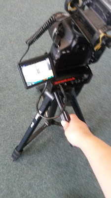
     180 Degree Rule

Set up of cameras following 180 degree rule
I would give myself 10/10 for 180 degree rule because we did not break it at any time during the film.
To ensure we kept the 180 degree rule, we kept the camera on one side of the room at all times. Even when we were filming outside the room, when Samuel enters, we made sure to stick to the same side. This means that we see Samuel opening the door furthest from the camera in one shot, then walking through the furthest door in the next shot. By sticking to the 180 degree rule, we made sure that continuity was correct. If we had broken the 180 degree rule, we would have broken the continuity, as Samuel would have walked one way, then the other. By using the rule, the film was smooth and the viewer was not distracted from the story. This meant that the viewer could follow the story and stay invested in the film without any distractions or confusions.

     Tilt


I would give myself 7/10 for our use of tilt, as it was used well, but could have been smoother and cleaner.
After the camera had panned to follow the ID card passing along the table, it tilted up, following the ID card and revealing my face. The effect of this was that it showed the importance of the card, and the fact that it was the focus of our meeting. This made the viewer intrigued as to why the card is so important, and what is going on in the scene. This made our film more engaging and interesting, as the audience becomes more invested in the story.

     Pan


I would give myself 6/10 for our use of panning shot. This is because although it was used well, at some points it wasn't particularly smooth, and seemed a bit shaky.
We used a pan twice in our film; firstly when Samuel was crossing the room, secondly when the ID card was slid across the table. I think our first use of it was slightly less successful, as it was slightly wobbly, and made the film feel less perfect. However, we used it to good effect. By following Samuel's walk, we showed his journey across the room while also keeping a feeling of mystery about who he is, as we hadn't revealed his face yet. By using a pan, we also created a feeling of movement. This helped the viewer feel as if they were moving with Samuel, making them feel more involved and therefore more engaged. With the second pan, the one used to follow the ID card, it showed the importance of the card, as the viewer followed it. This made the viewer intrigued about why the ID card was so important, and what it meant for the story. This, again, made the viewer more engaged in the film.

     What I Have Learnt About Filming

Filming this preliminary task has taught me several valuable lessons about filming. Firstly, I have learnt that it is very difficult to film with two people who are both filming and acting. Next time I will definitely film with one extra person than the number of cast in any given scene. Besides this, however, I have also learnt the importance of following the rules of filming, especially match on action and 180 degree rule, as using these correctly means that the viewer is always involved, and they forget that they are watching a film and begin to believe that the film is real. I will take extra care to make sure that these rules are followed, so that the film is absorbing and engaging. I will also make sure that if we use pans and tilts that they are smooth, as when they go wrong (like when Samuel is walking) the audience is distracted from the story of the film. I would also use over the shoulder shots, because there is something slightly odd about just filming a person on their own talking with another person, possibly because it makes them seem as if they are not talking to anyone. Next time I film something, I will definitely follow these rules.

     What I have Learnt About Editing

I have learnt many things about editing when making the film, mostly because I have never edited something by myself before, and I have never used Final Cut. One thing I have learnt about editing is that most of the sounds, effects and titles in Final Cut are incredibly cheesy. It is very easy to make something silly, cheesy, and funny using Final Cut - editing something serious is far more difficult. However, finding good, simple titles is relatively simple, and basic effects can be found as well. The real problem is avoiding the temptation to make a rainbow coloured flashy film with star wipes and bouncy music. I think next time I edit I will use a royalty free music website to find any backing tracks and sounds, as Final Cut's are fairly rubbish. I think one successful aspect of my editing is the length of the shot cuts, as all of them are a fairly good length. I did this by doing what felt natural, which probably comes from the ideas I've absorbed from years of watching films. This means for my actual film I will do whatever feels right and natural in editing.

     Shot Types

I think the most effective shot in our film was the two shot, with a medium close up of Samuel and a long shot of me. I think it is effective because it allows the viewer what I am doing (standing up) and how Samuel reacts.

Our most effective shot
One shot I wish we had gotten was a medium close up when Samuel says 'You'll understand one day'. The shot we have for that part is a mid shot, but from very far away. This looks very strange, and would have looked better if it was closer. The distance between the viewer and Samuel distances them, making the connection between viewer and story lessen. A closer shot would have kept the connection and have shown Samuel's face as he reacted. I would also have filmed more close up reaction shots, just so the audience could understand what me and Samuel were thinking.


The shot I would have changed